- Like
- SHARE
- Digg
- Del
- Tumblr
- VKontakte
- Flattr
- Buffer
- Love This
- Save
- Odnoklassniki
- Meneame
- Blogger
- Amazon
- Yahoo Mail
- Gmail
- AOL
- Newsvine
- HackerNews
- Evernote
- MySpace
- Mail.ru
- Viadeo
- Line
- Comments
- Yummly
- SMS
- Viber
- Telegram
- JOIN
- Skype
- Facebook Messenger
- Kakao
- LiveJournal
- Yammer
- Edgar
- Fintel
- Mix
- Instapaper
- Copy Link
Introduction
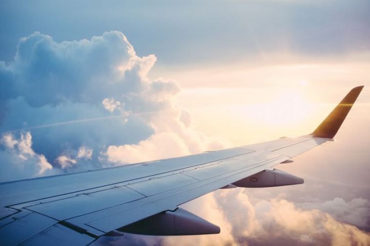
There’s a lot more which is needed by an Airline brand to be successful than just providing exceptional services (though of course that’s what will ensure customer loyalty at the end of the day). Branding, for airlines plays an integral role, now more than ever due to the vast competition that continues to emerge in the industry.
An impactful and remarkable logo is thus the first step towards effective branding for any airline. If you’ve just decided to fly into the industry, an airline logo designed with a smart approach is the first step towards effective branding.
A good airline logo design not only catches the eye but also plays an integral part in gaining customer loyalty and recognition. One glance at an airline logo designed by an amateur and your potential customers may never even think about entering the booking office let alone about boarding the plane. A major reason why airline branding should be taken so seriously is the fact that people really need to trust an airline before deciding to leave the ground!
While we’re on the topic of how important airline logo designs are in the aviation industry, taking inspiration from some toppers in the field (or in the air) is as important as having an original identity. Ironic but true. You learn from the best!
To make all that learning part easier however, I’ve listed down a few common factors which may contribute to an impactful airline logo.
1. Typography: how did you write it?
 You may have chosen the perfect name for your airline but didn’t pay attention to how it was incorporated into your logo or word mark. Red light! That’s a big mistake. The typography of your air logo design should most likely feature bold or sans-serif fonts since not only do they possess the quality of showcasing a cordial attitude but also have high readability and convey a serious yet soft image.
2. Color Palette: which colors did you choose?
As with logos of other industries, your color theme for an airline logo’s design communicates your vision or the image which you want to portray. Blue, red and yellow are mostly associated with airline logos to depict enthusiasm mixed with sophistication, though any country’s national airline will usually pick colors from the flag to exhibit patriotism.
3. A contemporary approach
 While “isms” are taking over the world at every level, the term modernism has crept its way into logo designing as well. Here, artists tend to take a modern approach for logo designing, creating masterpieces that are both functional as well as attractive. Thus, any airline logo designed with the modernism effect will appeal to customers but will simultaneously be convenient to use in different mediums of advertising.
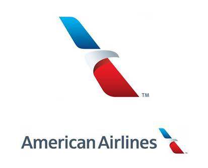
The American Airlines logo design is one classic example of a logo redesigned using the modernism effect. Using traditional colors from the American flag (red, blue and white), the logo is an abstract that illustrates an eagle ready to take flight. It’s simple, useful and powerful!
The Takeaway
In a nutshell, you need to invest some serious time, money and thoughts into your airline’s identity before the final take off!